Selected Work
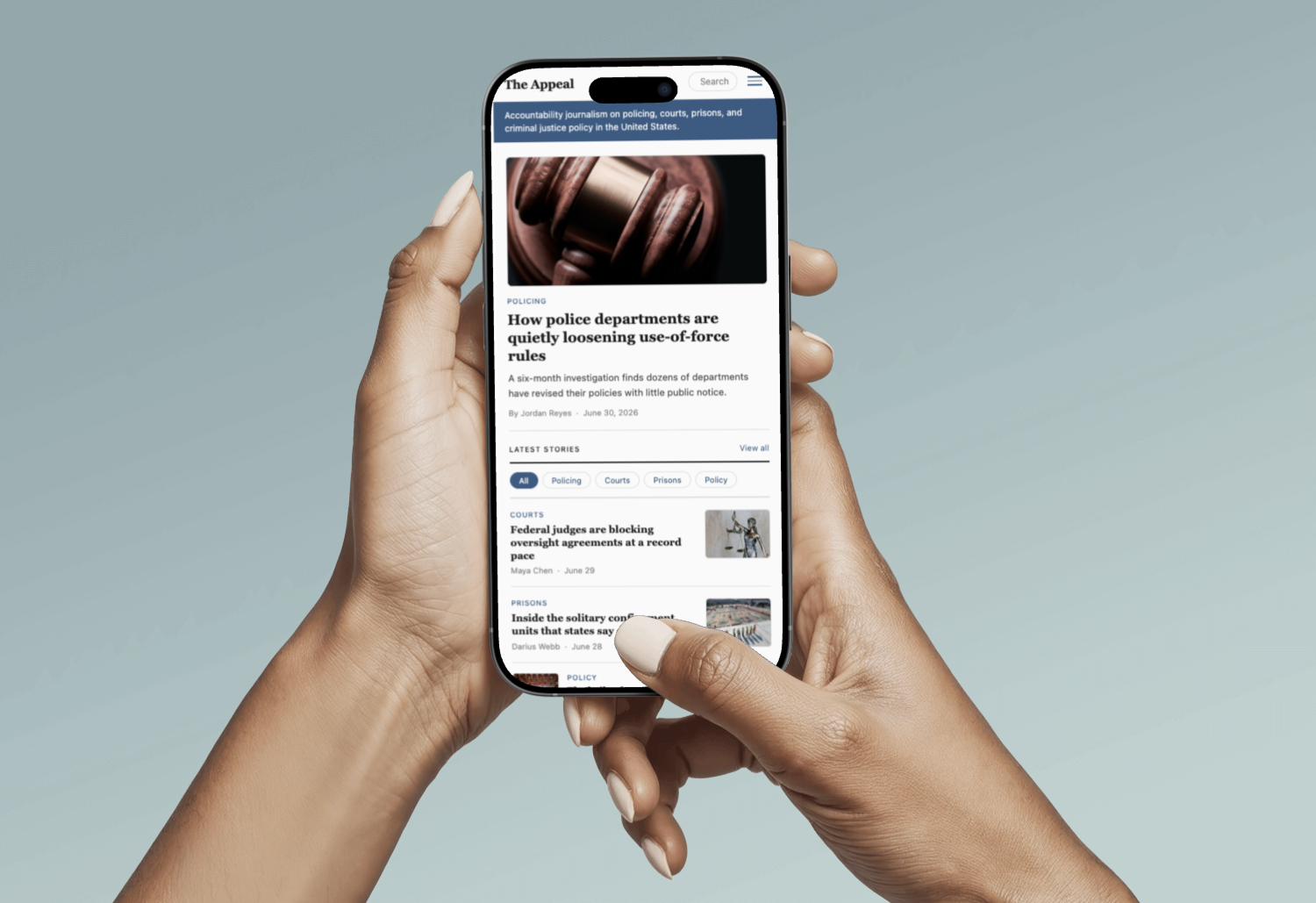
The Appeal Redesign
Project type: Unsolicited redesign / portfolio case study.
Role: UX researcher, information architect, wireframe designer.
Tools: Browser audit, site mapping, wireframing
Read Case Study →Creating immersive, accessible web experiences crafted to be read, felt, and remembered.
Project type: Unsolicited redesign / portfolio case study.
Role: UX researcher, information architect, wireframe designer.
Tools: Browser audit, site mapping, wireframing
Read Case Study →UI & Interaction Case Study
The Appeal is a nonprofit investigative news outlet covering policing, courts, prisons, and criminal justice policy in the United States. Its reporting is rigorous and important, and this project focuses on how the site's current structure can create friction for readers. I document recurring UX and information-architecture issues, identify which user needs are most affected, and propose a reorganized information architecture supported by wireframes for three core pages.
A hands-on audit of theappeal.org identified structural UX issues that share a common theme: the site's information design doesn't consistently match how readers navigate, orient, and decide what to read.
Navigation is fragmented across two menus and doesn't persist beyond the homepage, which makes it harder for users to return to where they were. Search is presented in multiple places (in the hamburger menu and again at the bottom of pages), creating inconsistency in how users expect to find it. On article pages, topic context appears only at the end, delaying helpful orientation. On the homepage, a full-width newsletter signup appears before any story content, asking for attention before users can quickly access value.
Rather than redesigning for aesthetics, the work is anchored in three user tasks:
Each element of the information-architecture proposal is tied to at least one of these tasks.
The Appeal's existing site structure, mapped from a hands-on audit. Marked nodes indicate problem areas and unclear hierarchy.
A redesigned structure built around the user tasks, offering persistent navigation, clear topic context, and an unobstructed path through the content.
*Fictional sample articles created for design demonstration. Not real news. No affiliation with any real organization.
One persistent navigation system.
The two-menu problem was resolved by consolidating into a single global nav — logo on the left as a home link, topic navigation in the center, search visible in the upper right where users expect it. This nav appears on every page, in the same position, with the active topic highlighted. Users always know where they are and always have a way out.
A mission statement before anything else.
The homepage now opens with a two-sentence description of what The Appeal covers, placed above the hero story. First-time visitors can orient themselves without clicking anywhere. This replaces the newsletter signup, which moves to the bottom of the page.
Topic context at the top of every article.
The topic label was moved from the bottom of the article page to immediately above the headline, doubling as a back link to the topic page. A breadcrumb trail provides a second path home. Readers are never disoriented about where they are in the site.
Structured topic pages.
The topic label was moved from the bottom of the article page to immediately above the headline, doubling as a back link to the topic page. A breadcrumb trail provides a second path home. Readers are never disoriented about where they are in the site.
Newsletter signup.
The newsletter ask appears once per page, at the very bottom, in a consistent location.
Redesigning The Appeal was a genuinely enjoyable challenge. The process sharpened my eye for information architecture and reinforced how much structure shapes a reader's experience in a publication before they've read a single word. The part I found most satisfying was the visual design phase, specifically working through color theory to land on a palette that communicates credibility and calm. Getting that emotional register right felt just as important as getting the navigation right.
Viewing a larger version of the selected mockup.